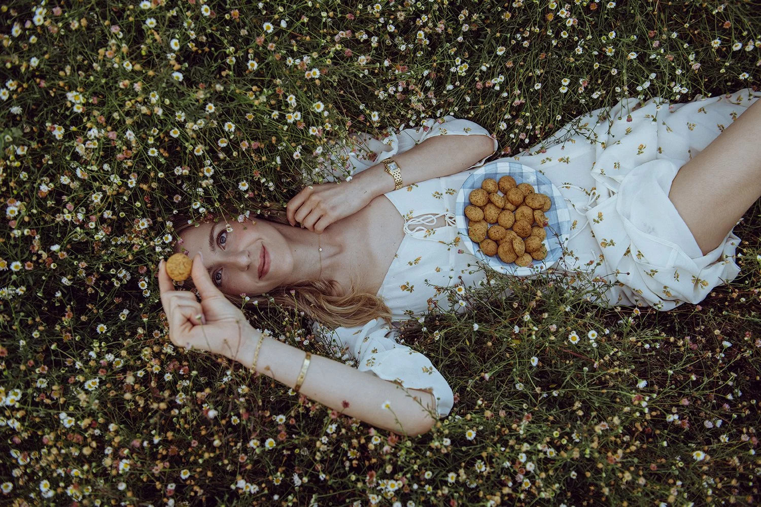

Chamomile Living
Brand Strategy, Visual Identity & Ecommerce Development
Chamomile Living is Greece’s only fully gluten-free and refined sugar-free bakery, operating from a licensed commercial kitchen in Athens as a ghost bakery (without a storefront). Before we began, the brand had no website, no ecommerce platform, and no structured digital presence. All sales were handled manually through Instagram DMs.
The product quality was exceptional, but the brand lacked clarity, positioning, and the infrastructure needed to grow.
My role was to translate a high-quality product offering that lacked clear brand positioning into a cohesive premium brand system, supported by a defined brand strategy, a distinctive visual identity, and scalable e-commerce infrastructure.
Project Snapshot
Role
Brand Strategy & Positioning
Creative Direction
Visual Identity Redevelopment
Brand Story & Audience Definition
Brand Imagery Art Direction & Production
Website Strategy, UX Design & E-commerce Setup
Launch Campaign & Social Media Strategy
Industry
Food / Specialty Bakery / Wellness
Location
Athens, Greece
The ChallengeBefore our collaboration, the brand had no website and no e-commerce platform. All sales were handled manually through Instagram DMs, with no structured SEO strategy, analytics tracking, or digital infrastructure.
While the bakery was professionally operated and ingredient-driven, its legitimacy, differentiation, and premium positioning were not clearly communicated. The quality of the product far exceeded the clarity of the brand.
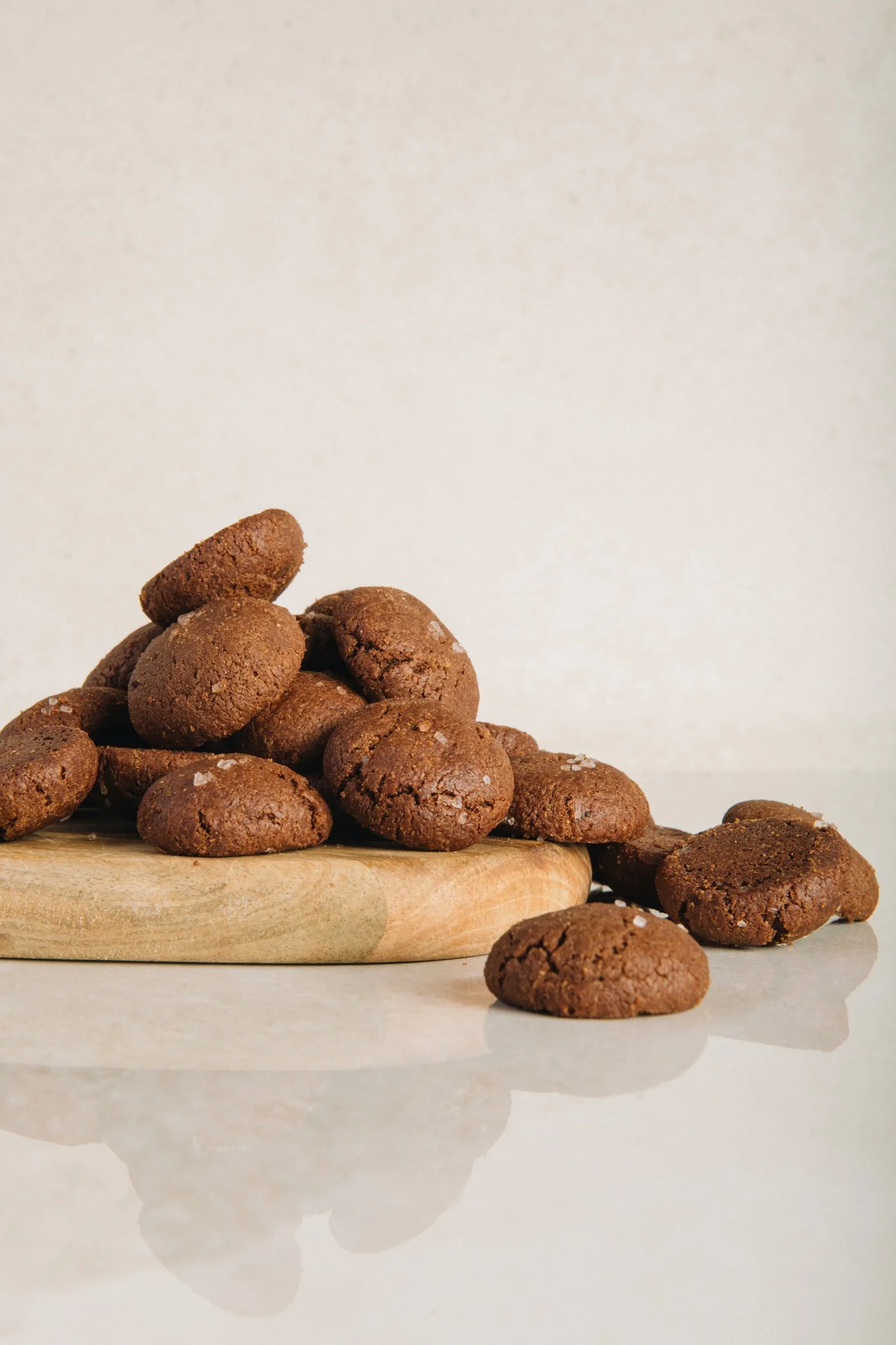
The foundation was there. It simply needed structure.
Strategic ShiftThis was just not a cosmetic update. It was a strategic reset. We aligned the business model, audience, and brand foundation before building the systems to support growth.
This work unfolded across three core strategic phases…
01 Defining the positioning
Reframing the ghost bakery model and defining the ideal customer.
Chamomile Living operates as a licensed commercial ghost bakery producing made-to-order baked goods for pickup, delivery, and shipping across Greece. Part of the work involved reframing the ghost bakery model as intentional and professional while clearly communicating the brand’s premium ingredient standards. The ideal customer was defined as health-conscious women and mothers who prioritize ingredient integrity and appreciate refined, thoughtfully made food. This positioning allowed the brand to confidently occupy an elevated market space rather than compete on price.
02 Shaping the identity
Developing the mission, brand story, and strategic positioning.
A clear strategic foundation was developed to guide the brand moving forward. This included defining the mission, brand values, brand voice, and positioning. The founder’s personal journey with anorexia and her reconnection to food through baking became an important part of the brand narrative, reinforcing themes of healing, nourishment, and intentional ingredients. This strategic work ensured that every visual and digital touchpoint would feel cohesive and authentic.
02 Bringing the brand to life
Designing and building a scalable e-commerce website.
A major component of the project was building the brand’s first e-commerce platform. The website was designed and developed entirely in Squarespace to provide a cost-effective solution that the founder could manage independently without relying on an agency for routine updates. The site includes ecommerce functionality, product pages highlighting ingredients and craftsmanship, custom cake ordering, and clear information about pickup, delivery, and shipping. The result is an intuitive digital experience that functions both as a sales platform and a brand storytelling tool.
With the strategic foundation clarified, the next step was translating the positioning into a cohesive visual identity and brand experience.
Visual System
With the strategic positioning clarified, the next step was translating the brand foundation into a cohesive visual identity that expressed the owner’s distinct aesthetic and her ambition for the brand to feel warm, elevated, and elegantly feminine.



The original logo provided a foundation, but the refined identity was developed to more clearly express the brand’s elevated positioning and aesthetic direction.
Identity Evolution

Original Identity

Refined Identity
The logo was developed in collaboration with one of Rosenberg Reklamebyrå’s head designers, Thomas Stampe, with my creative direction and close collaboration helping shape an identity that aligned with the owner’s vision for something delicate, feminine, and high-end. Refined from the previous all-caps identity, the new logo was designed to feel more distinctive, warm, and inviting. The lowercase “chamomile” creates a softer, friendlier expression while still feeling elevated and unique. Paired with “living” in a delicate handwritten script, the logo brings in movement, softness, and a more personal touch. Together, the two type styles create a feminine, high-end identity that feels open, elegant, and welcoming.
Logo Design

To further enhance the identity, delicate, custom line-drawn chamomile florals and leaves were introduced as supporting brand elements. These details add softness, charm, and a more crafted feel to the packaging, helping extend the brand world in a way that feels feminine, thoughtful, and visually distinctive.
Design Elements



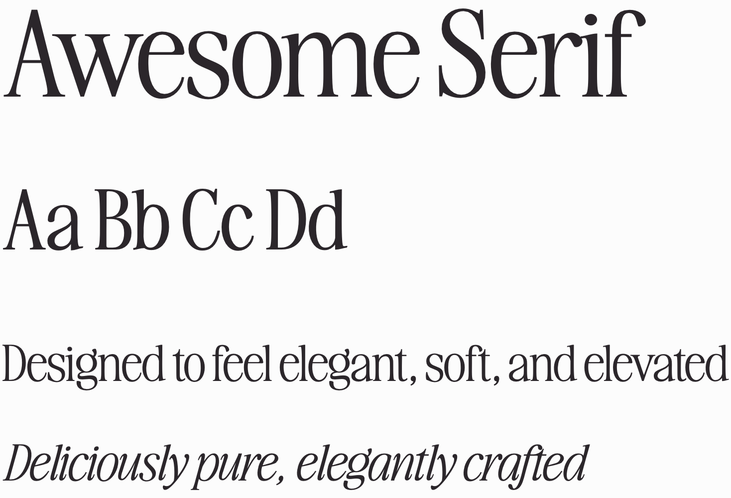
Awesome Serif was chosen for its refined, feminine character and editorial elegance. Its delicate contrast and soft curves helped express the brand’s elevated positioning, while the full type family, including italics, allowed for flexibility across packaging and supporting brand details.
Typography
The color palette was designed to feel soft, elegant, and gently indulgent. Warm blush tones bring a sense of sweetness and femininity, echoing the delicate, inviting nature of the bakery itself, while chocolate brown adds depth, richness, and a more refined sense of contrast. A warm gray base keeps the palette feeling balanced and elevated, allowing the sweeter tones to remain graceful, understated, and high-end.
Color Palette
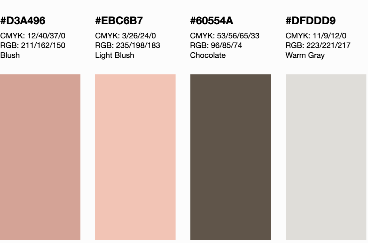
Although the logo uses its own complementary type treatment, the supporting typography and color palette were designed to work seamlessly alongside it, creating a brand world that felt soft, elevated, and consistently premium across packaging and future touchpoints. Below are a few packaging mock-ups we developed for the owner to visualize how the brand can work together as a system. Additionally, there are real applications to see how the brand works in different uses.
Application
Cookie packaging mock-up
Cake box mock-up with branded materials
Real brand applications (photos from @chamomile.living on instagram)
Real brand applications (photos from @chamomile.living on instagram)
E-commerce Platform
With the brand foundation established, the next step was translating it into a seamless e-commerce experience that made the offering clear, credible, and easy to purchase.
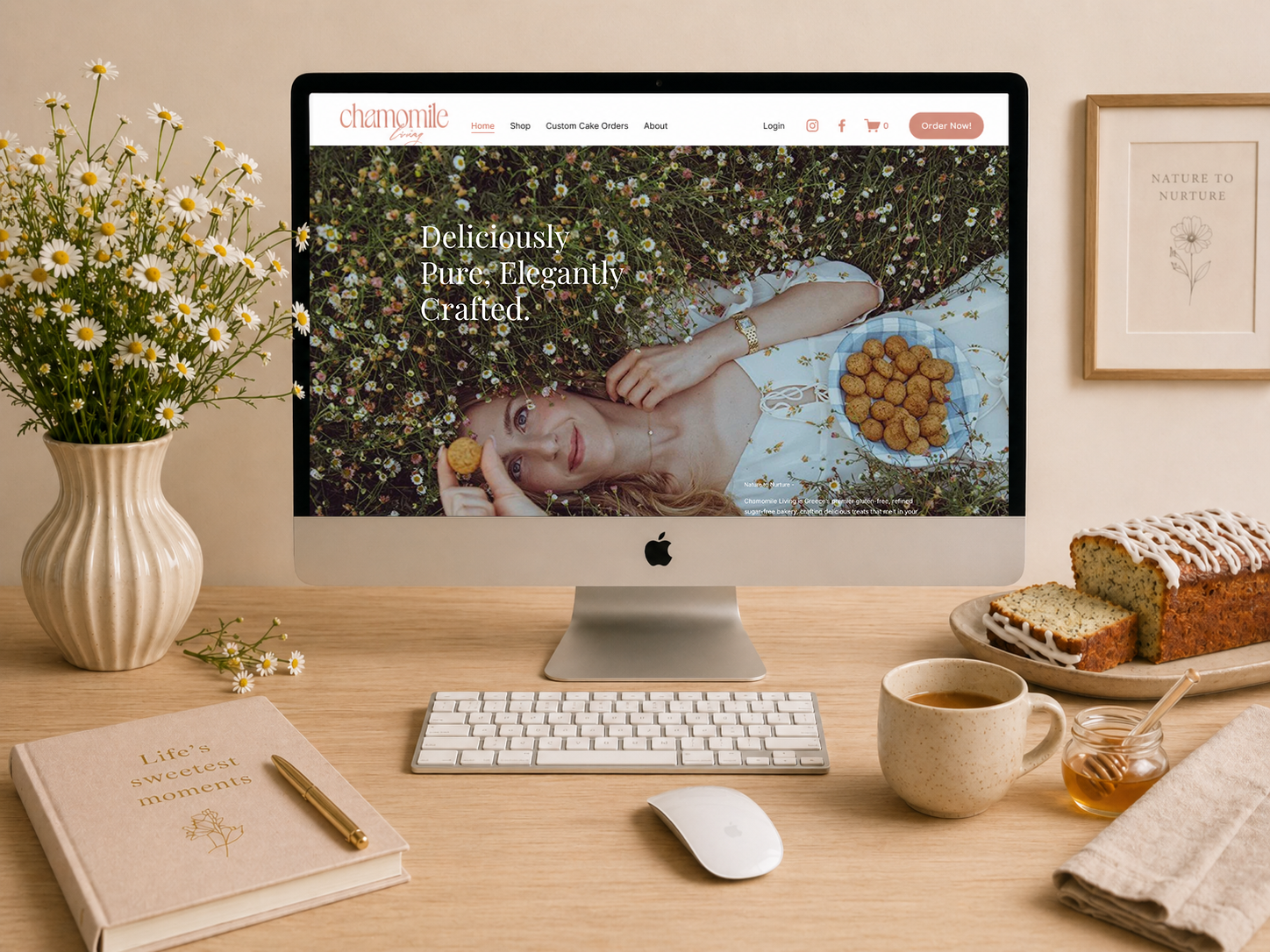
A dedicated ecommerce platform designed to showcase products, tell the brand story, and support online ordering.
I designed and built Chamomile Living’s first e-commerce website in Squarespace, creating a structured platform that moved the business from manual Instagram orders to a clear, user-friendly online shop.
The website was designed not only to sell products, but to communicate the brand’s positioning as a commercial gluten-free bakery, clarify the ghost bakery model, and build trust through transparency around ingredients, process, and the founder’s story.
I developed the full website strategy, UX structure, and design, ensuring the platform balanced aesthetics with functionality. The goal was to create a cohesive digital experience where customers could easily browse products, understand the brand, and place orders for pickup, delivery, or custom orders.
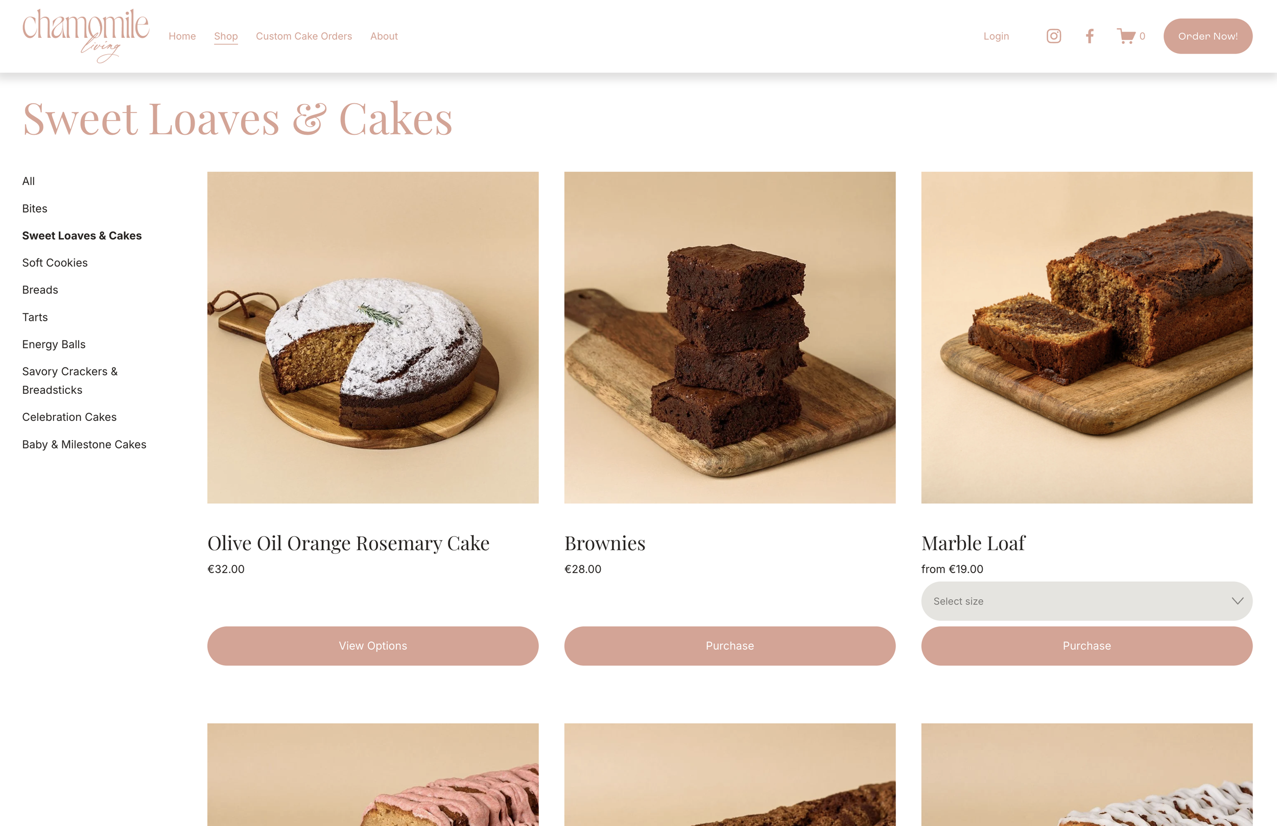
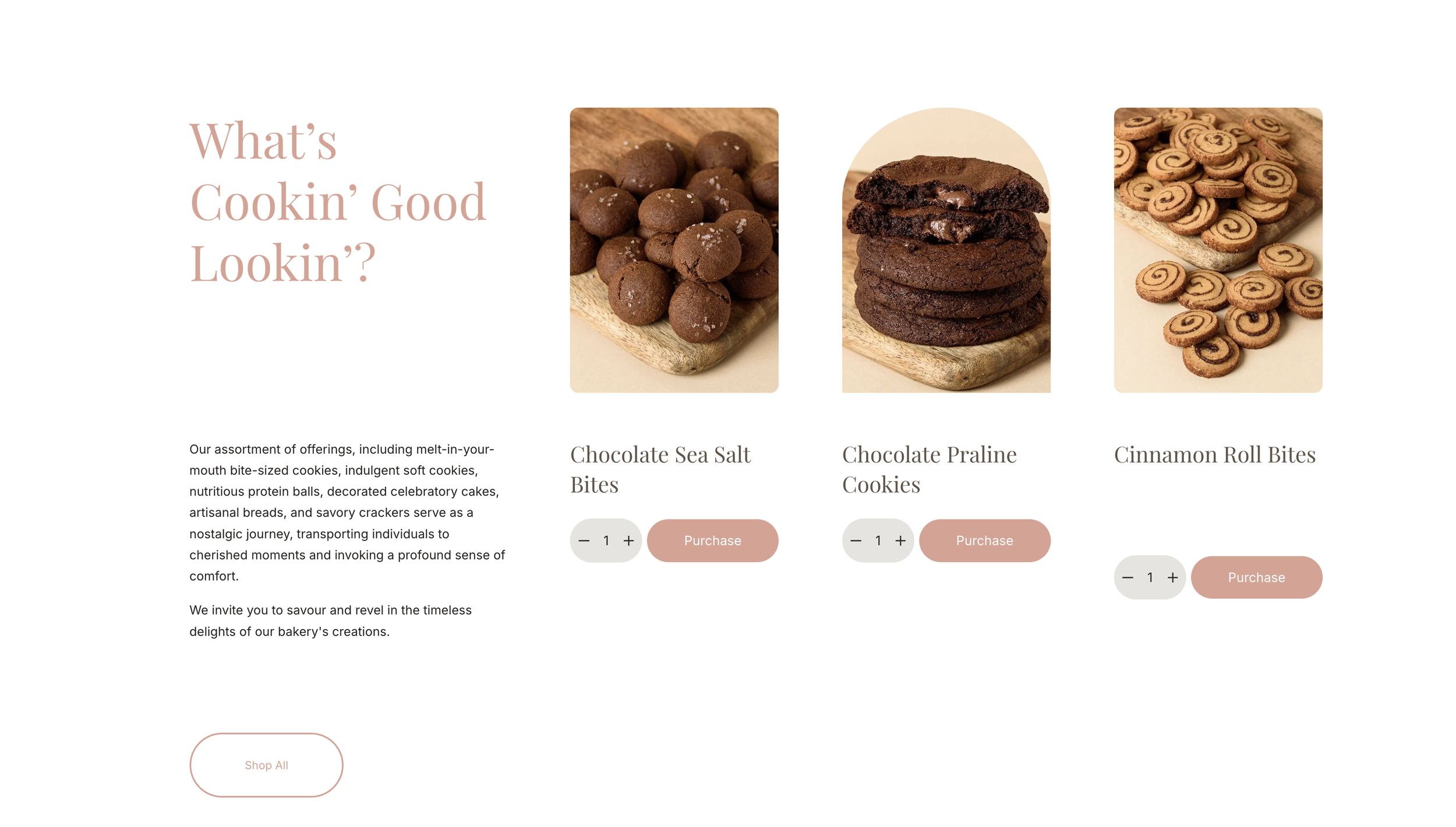
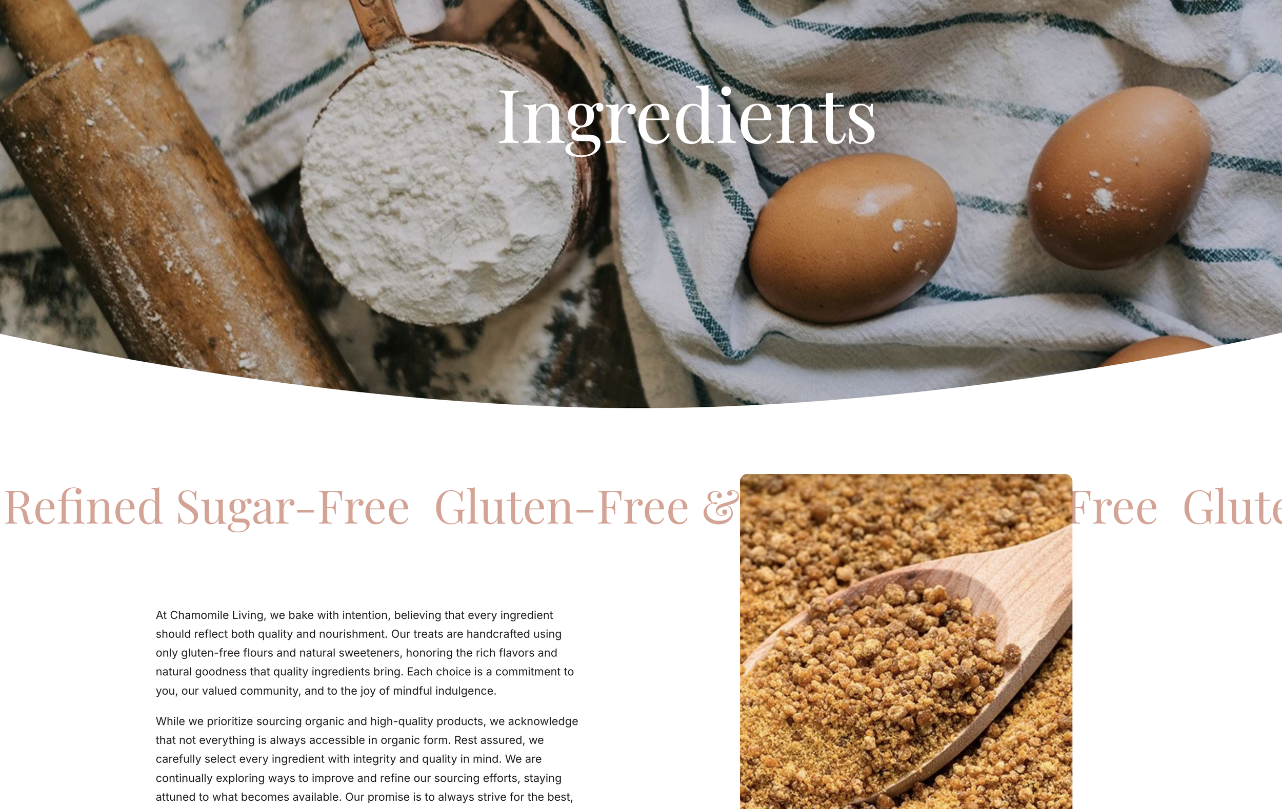
I structured Chamomile Living’s first online shop to make the product range easy to browse, understand, and order. Product pages clearly present each item alongside ingredient details, with links to a dedicated ingredients page highlighting the clean sweeteners, organic ingredients, and gluten-free alternatives used across the bakery. This reinforces the brand’s focus on transparency and quality.
The shop supports made-to-order products, custom cake requests, and clear fulfillment options for pickup or delivery within Athens, replacing manual Instagram orders with a more seamless and scalable ecommerce experience.
Webshop
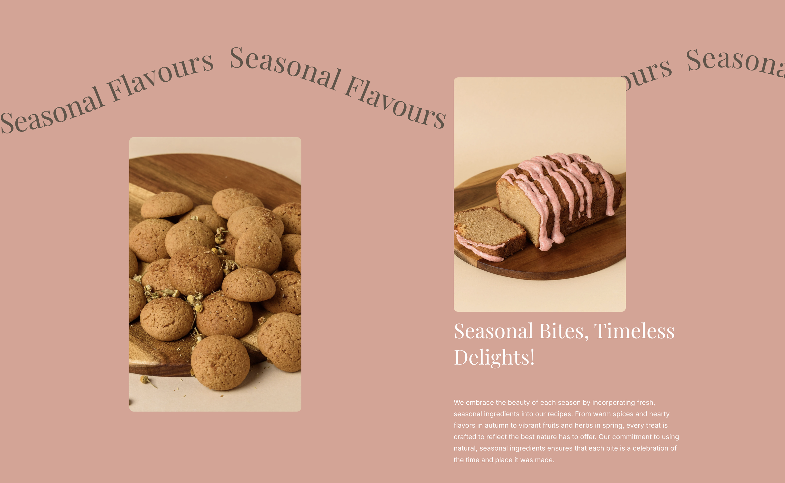
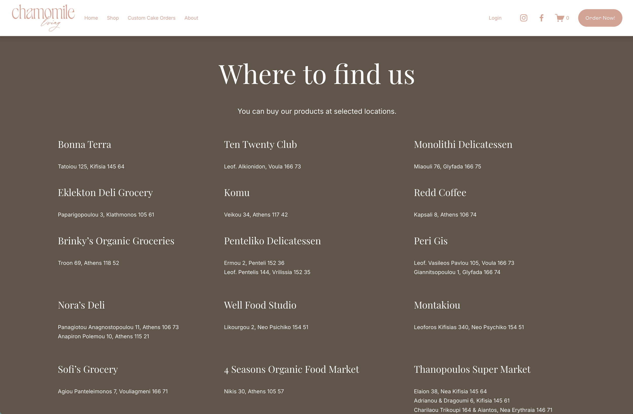
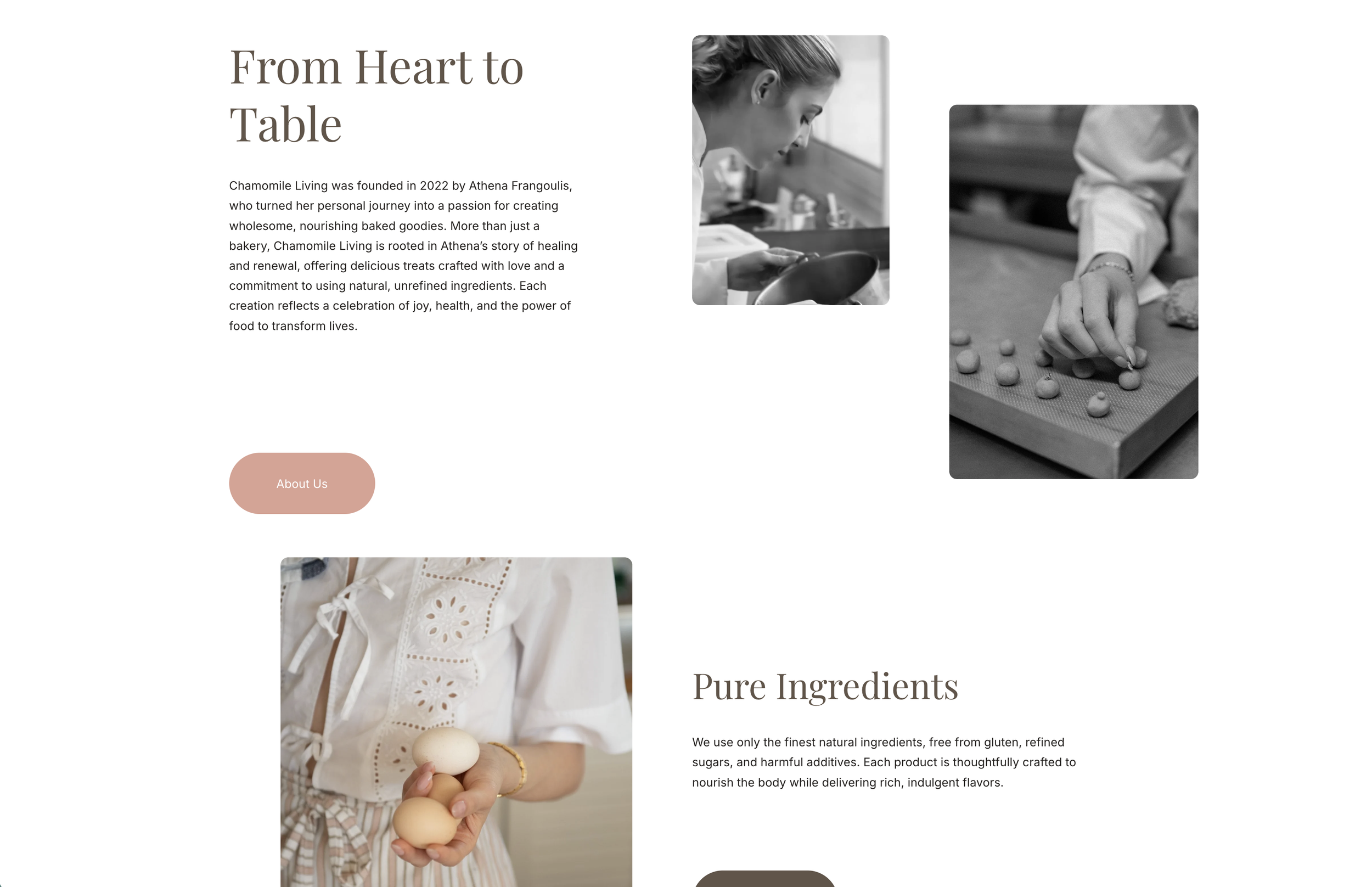
The website was designed to fully express the Chamomile Living brand through both language and visual experience. I developed the brand messaging and website copy, with headlines like “Nature to Nurture” and “From Heart to Table” to warm calls to action like “Treat Yourself,” ensuring each touchpoint reflected the brand’s tone, founder story, and elevated positioning.
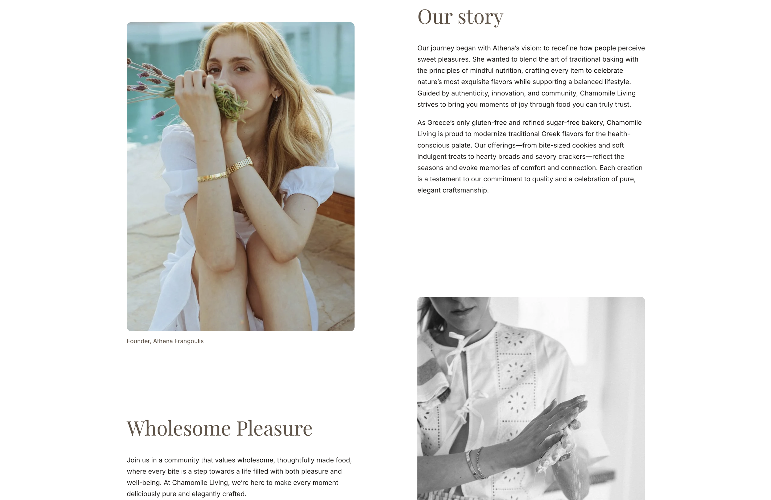
Athena’s journey and philosophy are woven throughout the site, creating a more personal and authentic connection to the brand. Ingredient transparency also plays a central role, with dedicated product details and an ingredients page highlighting the quality and intention behind the bakery’s gluten-free and refined sugar-free approach.
Together, the messaging, imagery, and structure create a cohesive brand experience for customers who value quality, aesthetics, and thoughtful, nourishing food.
Brand Expression
Result