CITY BRAND DEVELOPMENT

A flexible brand platform designed to connect a city and amplify its potential.
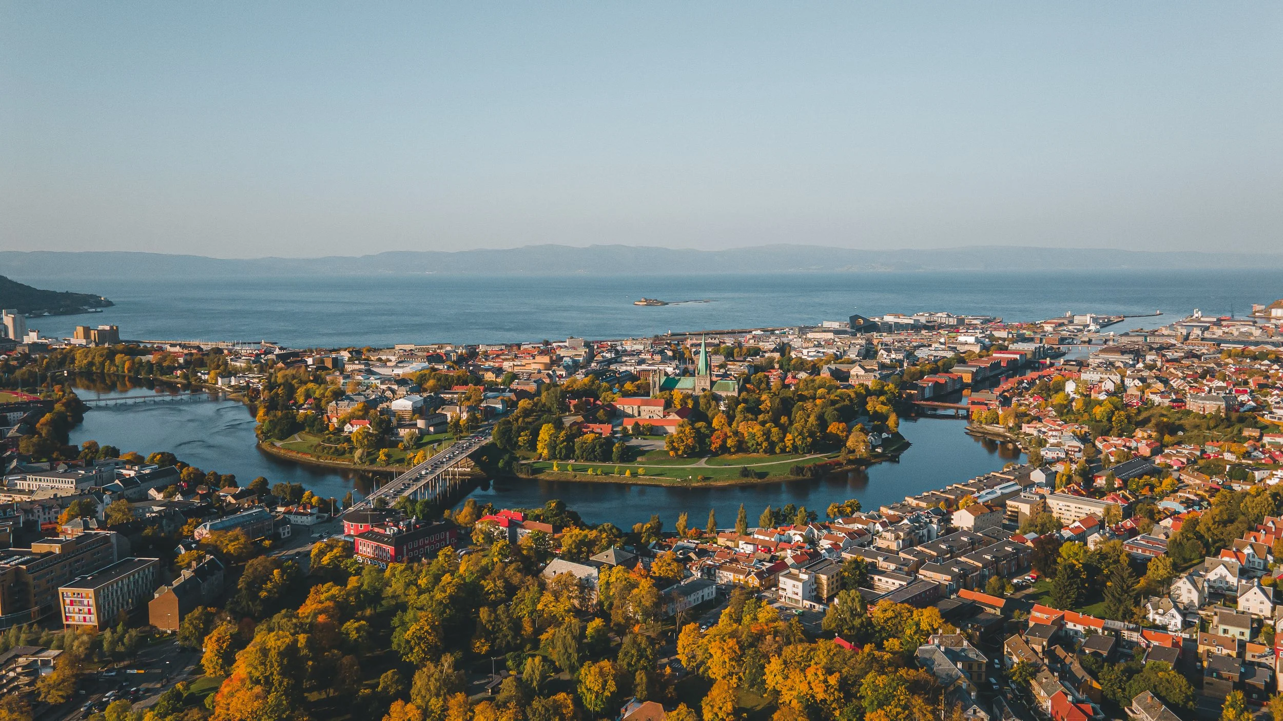
Initiated in 2021, the Trondheim City Brand was conceived as something much broader than a tourism identity. The ambition was to connect the city's different strengths, bring greater visibility to what Trondheim has to offer and create a shared identity that organizations across the city could build upon.
The project began as an initiative I spearheaded during my time at Visit Trondheim, working with creative agencies, designers and local stakeholders to establish its strategic and visual foundation. Today, the brand sits within Trondheim Kommune, where I continue to lead its development, creative direction and activation.
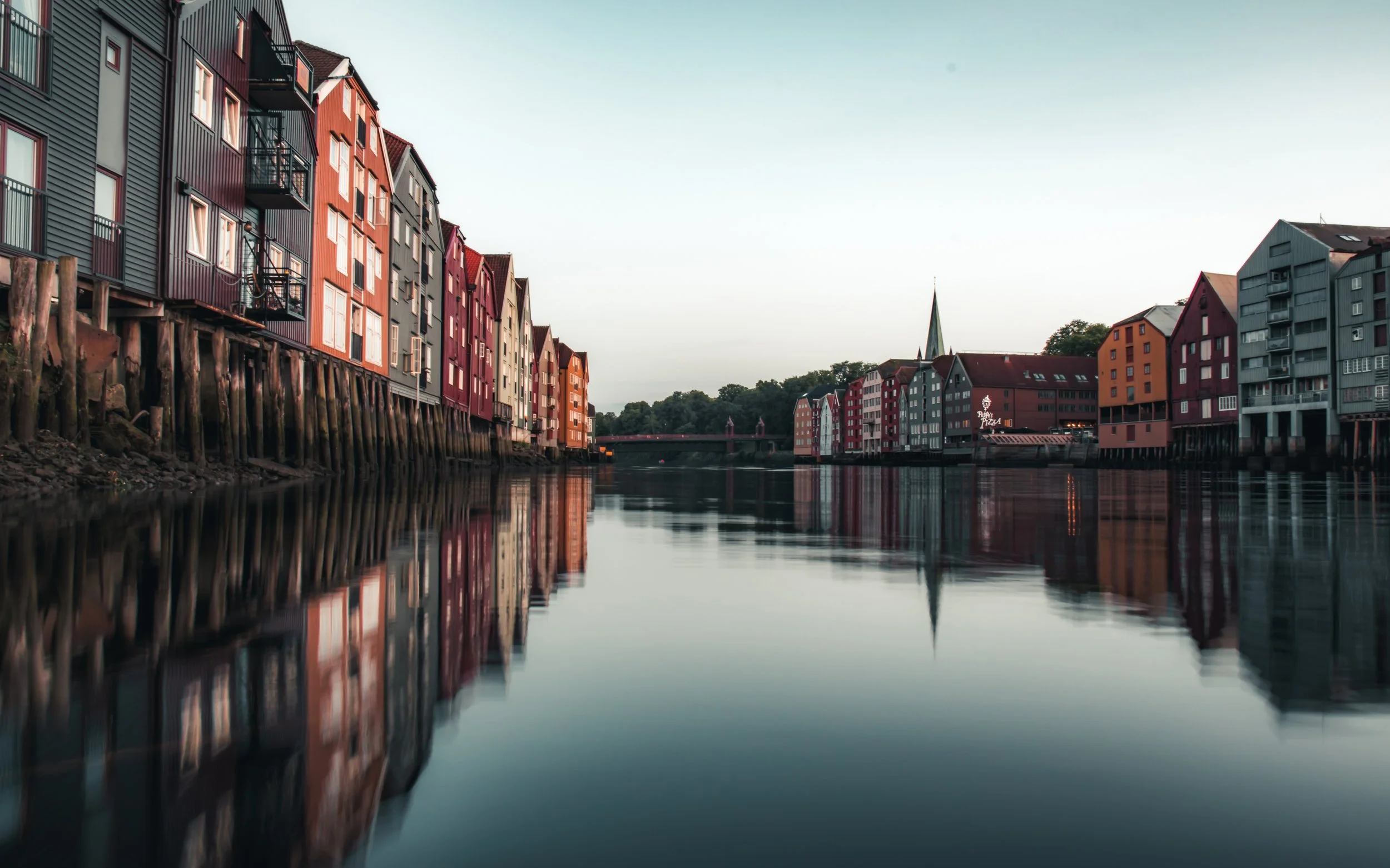
Photo: Mykola Ksenofontov
Project Snapshot
Client
Trondheim Kommune (2024-present)
Visit Trondheim (2021-2022)
Scope
Place Brand Strategy
Brand Development
Brand Architecture
Creative Direction
Storytelling Strategy
Role
Brand Strategy, Creative Direction & Long-Term Brand Development
Location
Trondheim, Norway
Trondheim had no city brand. No shared visual language, no unifying story, and no clear way to express what the city actually feels like.
Different sectors and organizations have been promoting Trondheim through their own lens and to their own audiences, from technology and research to food, culture, tourism and education. Each has a powerful story to tell, but there has been no red thread connecting them into a larger story of Trondheim.
No single strength defines why people choose a place. Technology and research may create opportunity, but it is the combination of career, culture, history, nature and quality of life that makes Trondheim compelling. The opportunity is to bring those strengths together through one place brand. A shared language for expressing Trondheim as a whole, not only what the city is known for, but what it feels like to live, work, study, visit and build something here.
The Challenge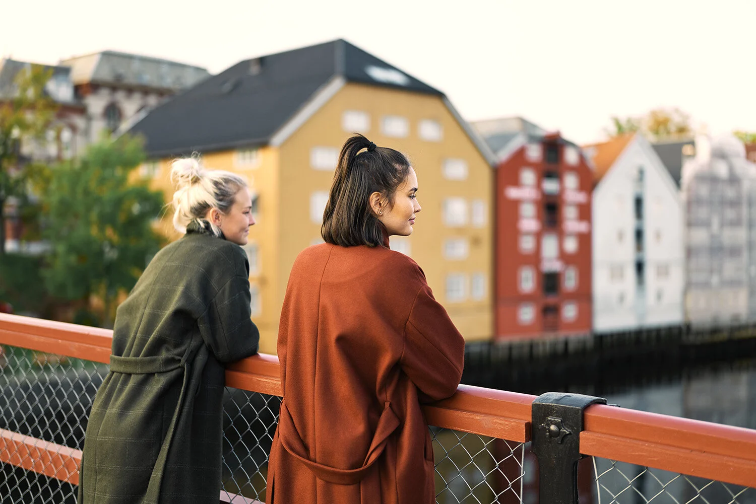
The Brand StrategyWorld-class research, cutting-edge technology, Michelin-starred gastronomy, a thriving music and cultural scene, and more than a thousand years of history. All in a compact city with the forest and fjord on its doorstep.
But what was interesting wasn't simply the concentration of these strengths. It was how Trondheim's size brings them together. People, industries and ideas exist close enough to connect, creating opportunities to collaborate, contribute and have a tangible impact on the city.
That became central to the brand strategy. Rather than defining Trondheim by any single industry or attraction, the opportunity was to communicate what happens when all these different strengths come together, and what that makes possible for the people who choose to be here.
A small city with unusually
big opportunities
01 / The Shared Story
More than a reason to visit.
Early conversations with decision-makers across industry, education, culture and tourism revealed a shared challenge. Trondheim had plenty to offer, but its strengths were largely communicated independently, without a common narrative connecting them.
The opportunity was to develop a brand that could bring these different strengths into focus, strengthen Trondheim's visibility and build a greater sense of local pride.
02 / The System
Designed to connect. Built to evolve.
From the outset, the brand was conceived as a flexible platform rather than a fixed visual identity. It needed to accommodate new initiatives and sub-brands while also allowing established organizations to communicate their connection to Trondheim without compromising their own identities.
This thinking shaped the brand architecture: a recognizable visual language and a shared strategic foundation that could create consistency across different sectors, audiences and applications.
Visual System
A visual language that connects past and future.
Trondheim has more than a thousand years of history, but it's also a city shaping what's next. The challenge was to create an identity that felt distinctly Trondheim, something people could recognize, connect with and feel proud to be associated with.
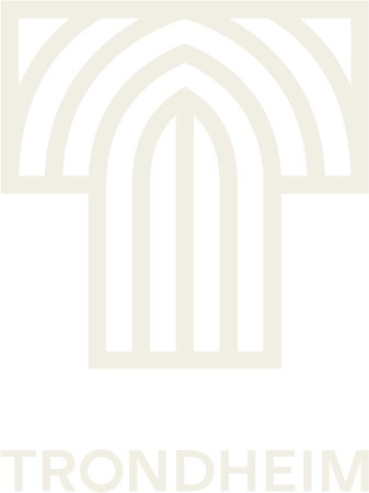
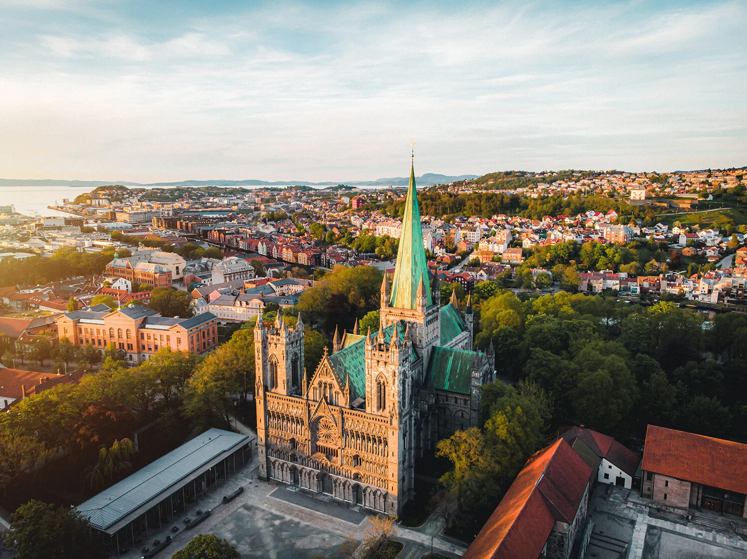
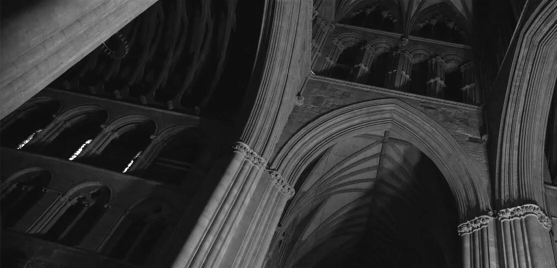
During the early creative exploration, I suggested Nidaros Cathedral as a source of visual inspiration. Beyond its architectural significance, it's one of the city's most recognizable landmarks and a longstanding symbol of local pride. Working closely with creative agency ANTI (now Nonspace), we translated that inspiration into a bold, contemporary visual identity, with the cathedral's distinctive arches informing the geometry of the Trondheim brand mark.

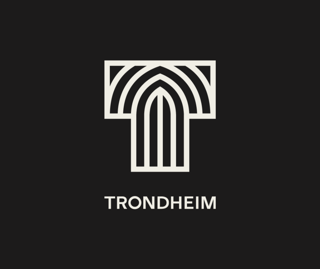
THE BRAND MARK
Inspired by a city icon
The Trondheim brand mark makes a bold statement for Trondheim. The ‘T’ symbol encapsulates the soft curves of the arches inside Nidaros Cathedral with a modern execution. Thus, creating the perfect contrasting elements from, clean to ornamental, calm to energetic, historical to modern, 8th – 21st century.
A visual foundation that’s built to grow
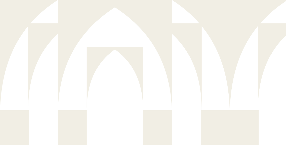
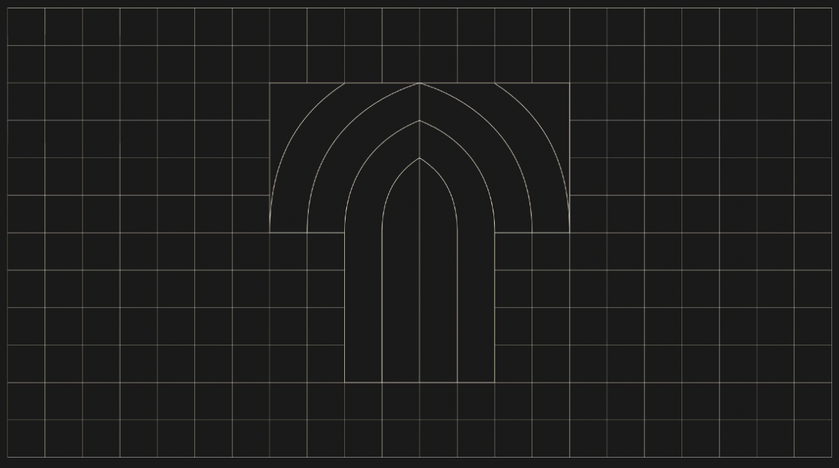
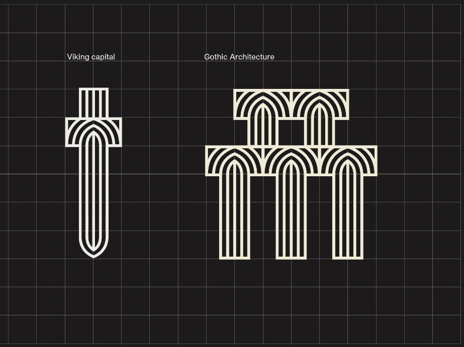
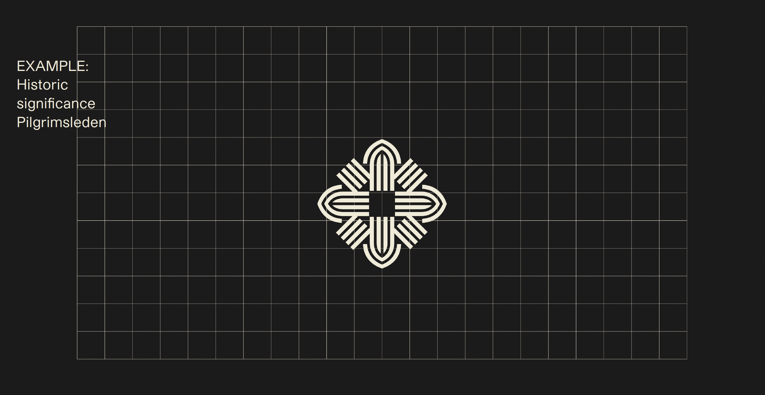
The brand mark was developed on a geometric grid that became the foundation for a much wider visual system. Its shapes could be rearranged, extended and reinterpreted, creating a recognizable design language with room for new ideas, applications and identities to emerge.
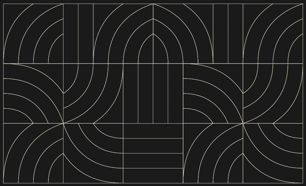
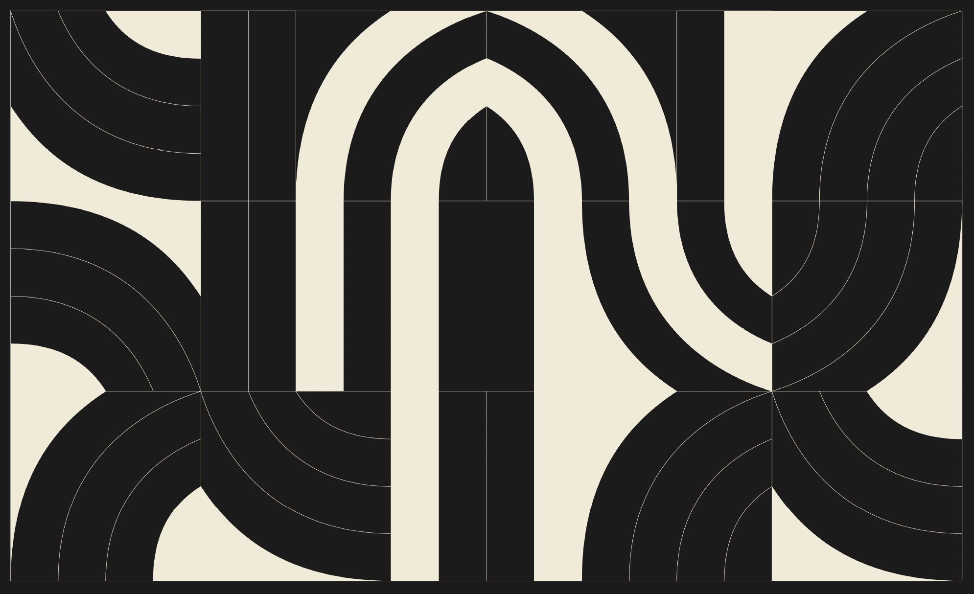
One system. Many expressions. Potential for new identities.
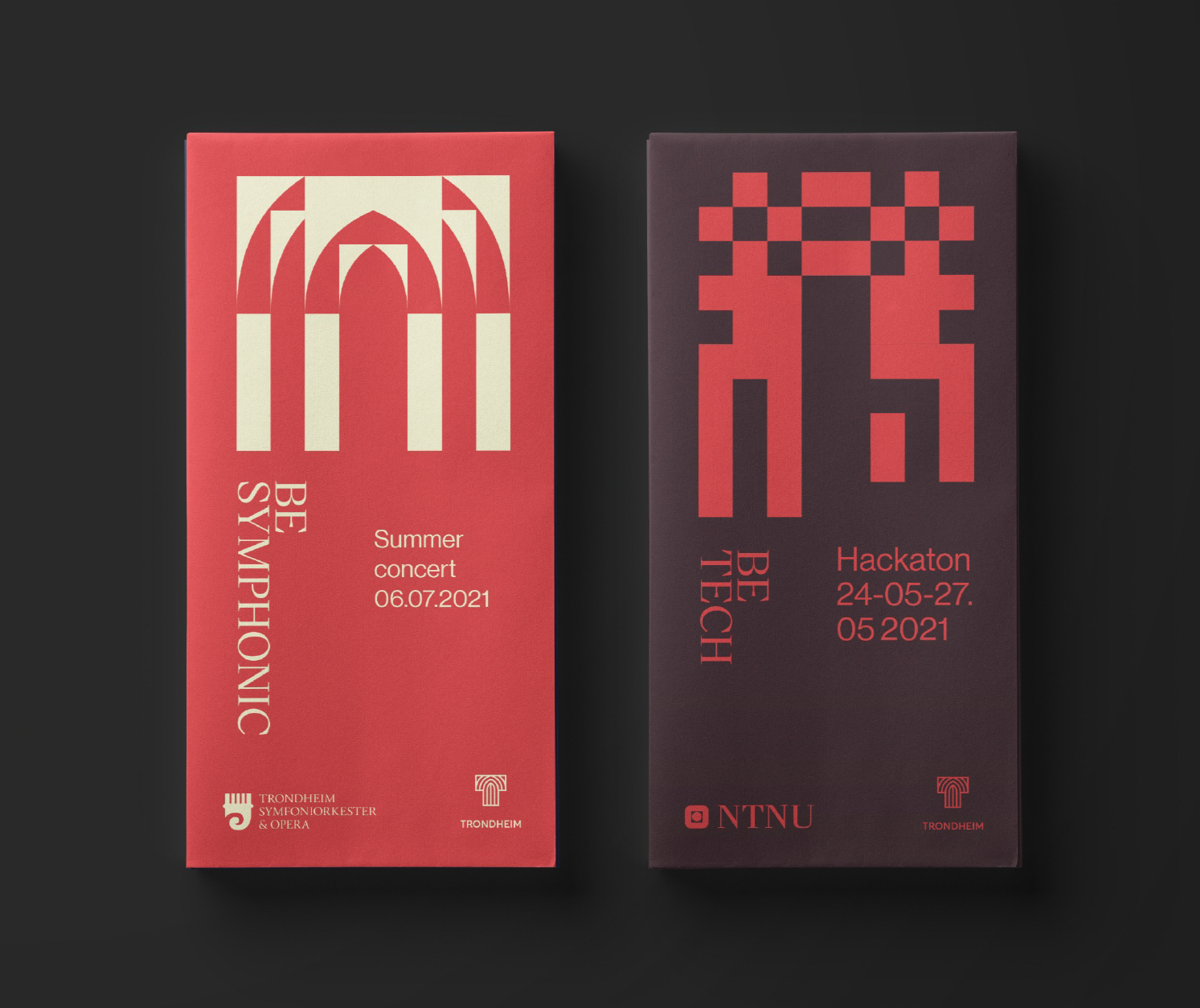
From culture and gastronomy to technology and innovation, the system allows different themes to take on their own visual character while remaining connected to Trondheim. The patterns can be dialed up or down depending on the context, offering a subtle way to communicate that connection without putting the city logo on everything.
Make Your Mark
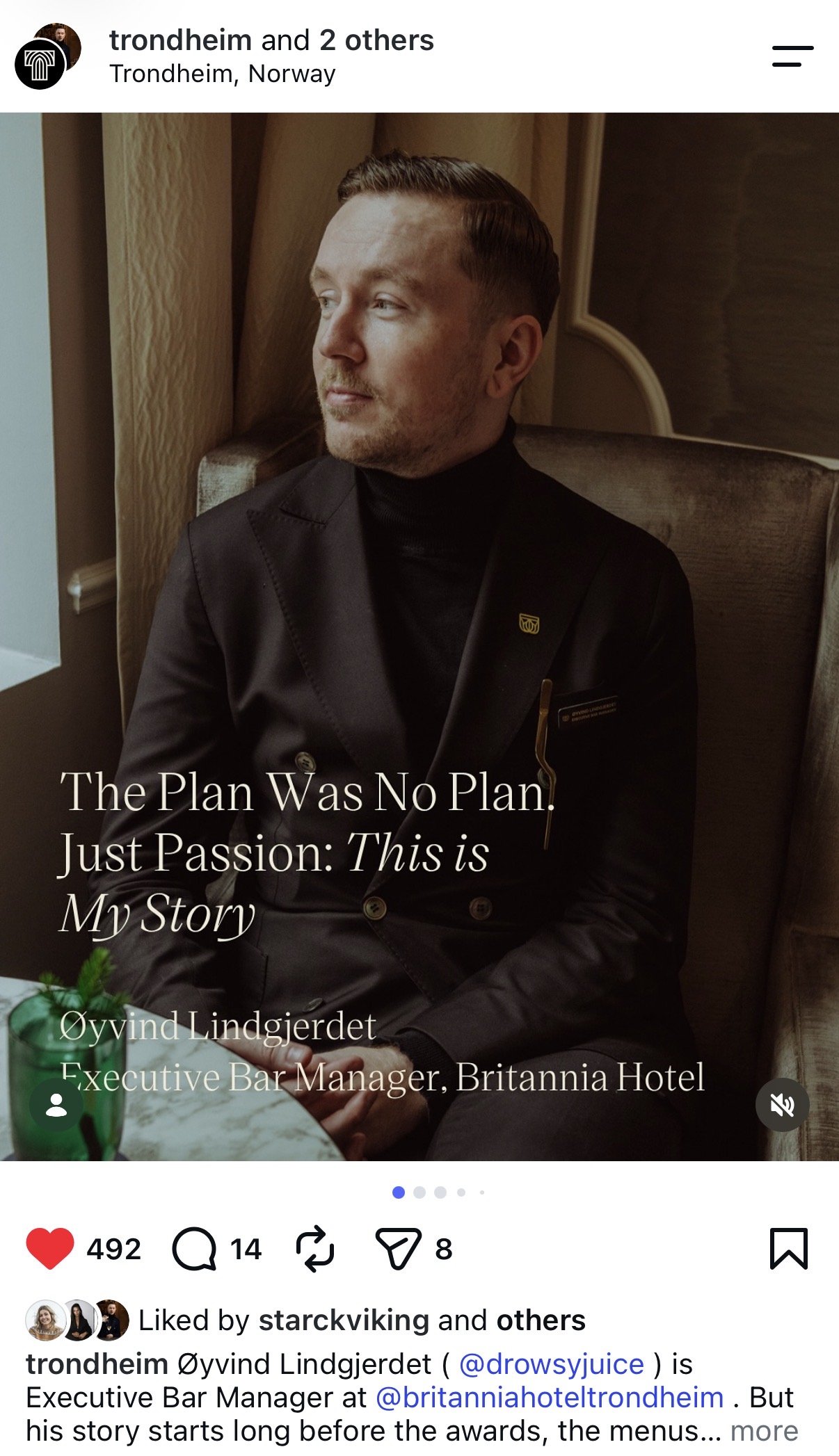
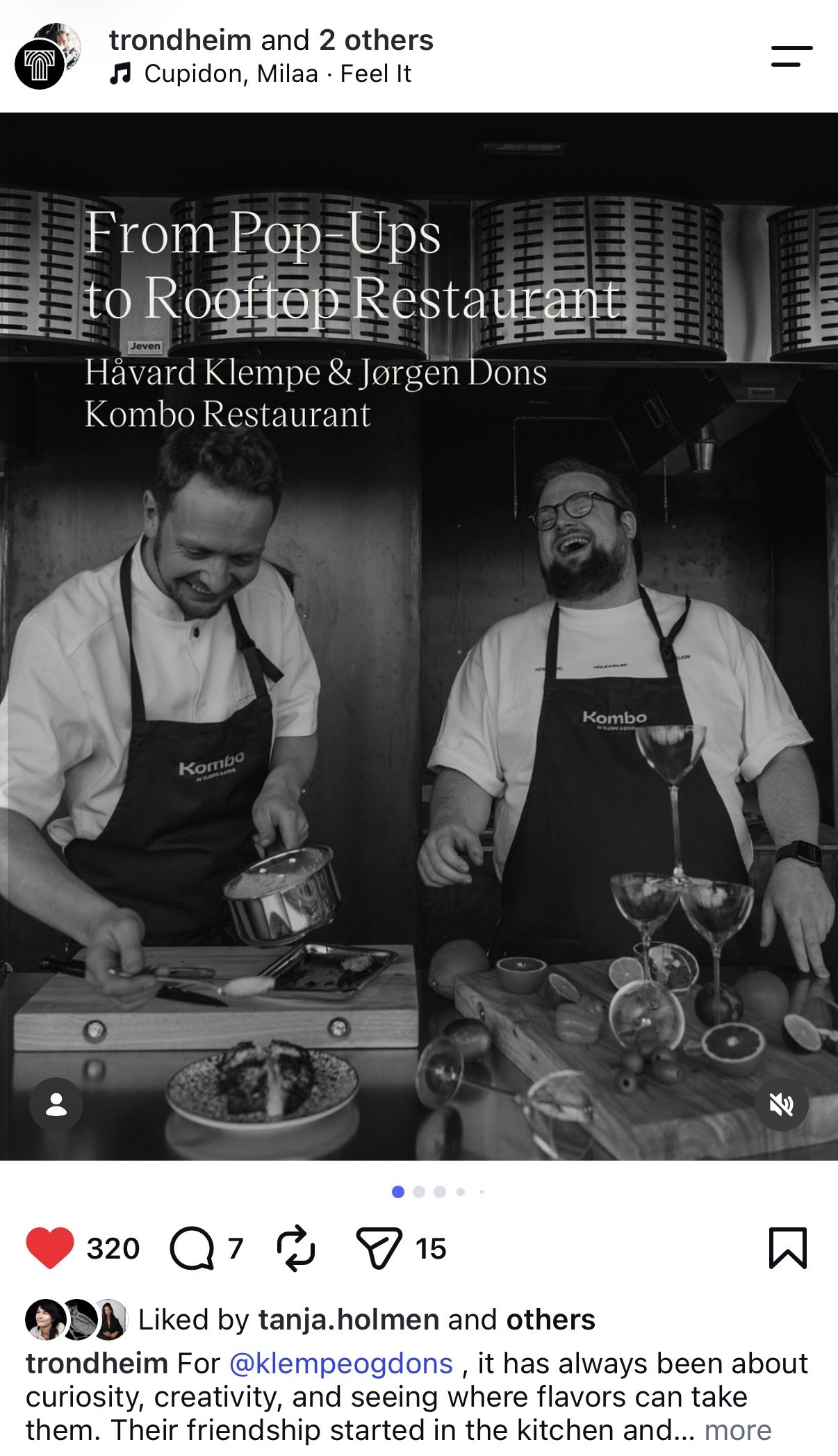
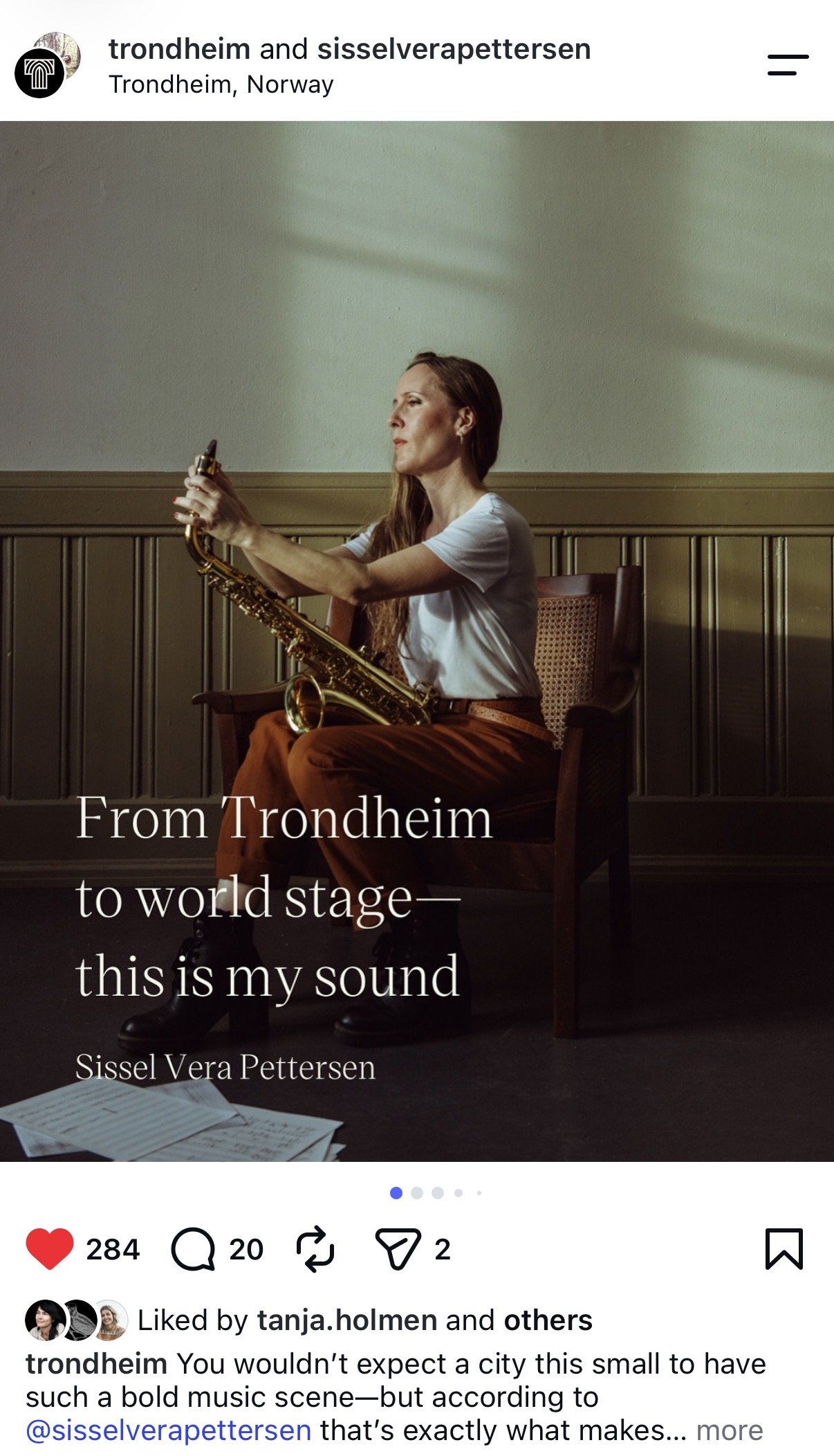
There's no shortage of interesting things happening in Trondheim. The real opportunity is in the stories behind them. I think the important distinction is that Make Your Mark isn't simply a new tagline. It's the evolution of the original brand thinking into a storytelling strategy. And rather than making big claims about Trondheim, we're using real people and their experiences to demonstrate what makes the city interesting and attractive.
Storytelling Strategy
From Become Trondheim
to Make Your Mark
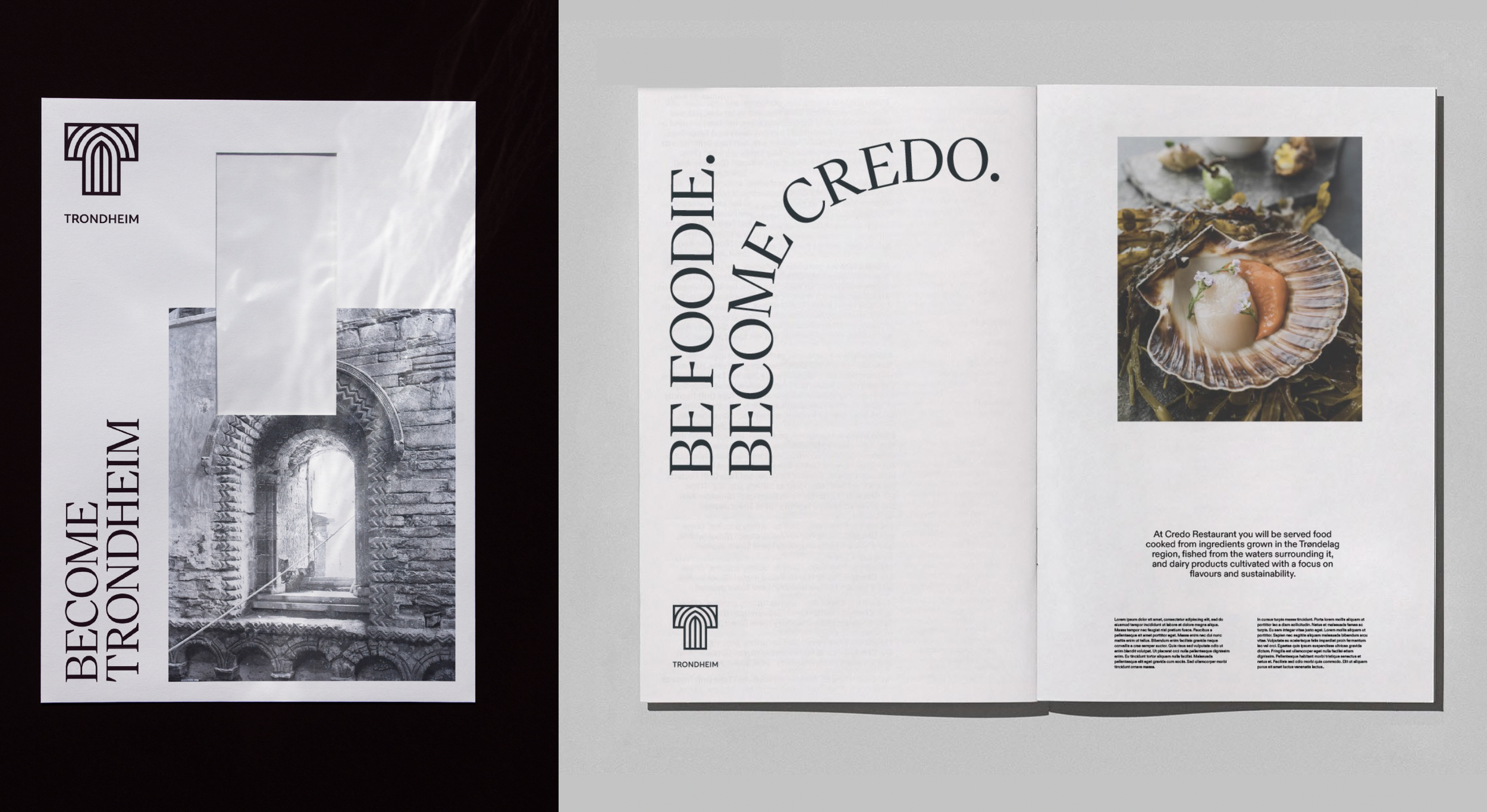
When we first developed the brand in 2021, Become Trondheim was the starting point for how we imagined telling the city's story. But as the work evolved, we found a stronger idea already at the heart of the strategy: Trondheim leaves a mark on you, and you leave a mark on Trondheim.
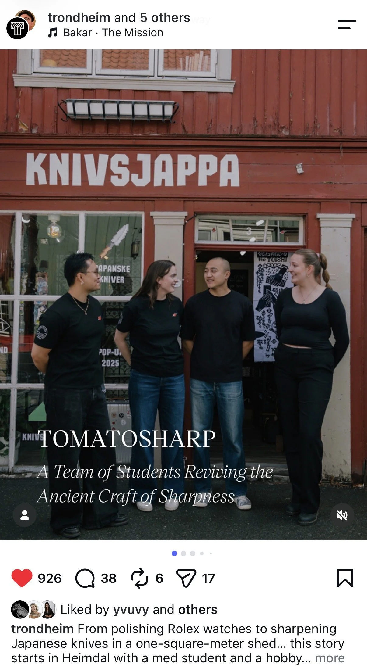
That thinking became Make Your Mark in 2025. More than a tagline, it's a strategic storytelling vehicle built around the people, ideas and businesses shaping the city. Rather than making claims about Trondheim being the capital of technology or food we let the stories speak for themselves.
Through The Journal on trondheim.com and @trondheim on Instagram, those stories come together, offering a closer look at what's happening here and the people behind it.
A work in progress. By design.
Now owned by Trondheim Kommune, the project continues to grow. In 2024, I was brought back to lead the next chapter of the brand's development.
From expanding the visual system alongside designer Vera Gomes, who was also part of the original creative team, and developing sub-brands like Study Trondheim, to connecting the dots between industries, businesses and organizations, the focus is on creating a common thread across the city's many strengths and making the brand a useful tool for collaboration, communication and visibility.
That thinking also carries through to Trondheim.com, where I've been leading the strategy and content, and collaborating with Vera on the creative direction. Developed by Increo, trondheim.com brings the city's stories, strengths and opportunities together in one place, giving the brand a home of its own.
Outcome